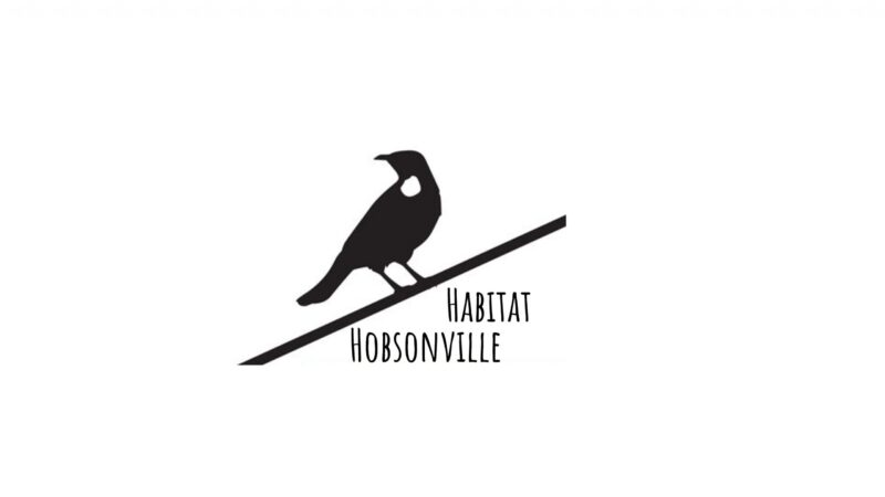
Drumroll… we are thrilled to announce the finalists for our #HabitatHobsonville logo design competition.
Now you have the opportunity to decide which logo represents Habitat Hobsonville the best by voting for your favourite logo. Please encourage all residents to vote. Once voting closes, if there is no obvious winner, the final decision will revert to the judging panel.
You can vote by emailing your favourite to [email protected] from April 1 – midnight April 9 or head over to the Facebook page “HPRS Group page”.
When judging the designs please consider the following….
Habitat Hobsonville is a new community project for all greening restoration initiatives in and around Hobsonville Point. The team have recently been granted funding by Auckland Council and HPRS, and work with Kaipātiki Project to do such things as remove animal and plant species such as weed eradication and native planting, all on a voluntary basis.
To restore natural habitats, to remove animal and plant species that don’t belong and to bring bird song back to the Point.
Huge thanks to all our budding designers that took the time to enter the competition – we had 17 entries from a great variety of residents.
Following are the SIX FINALISTS below with explanations:
1. Carol Scott-Dye – I am inspired by the local seashore birds that I encounter on my daily coastal walks and bike rides around Bomb point and other Hobsonville coastal pathways. I would like to see an increase in their numbers and an improvement in their habitat to support this happening. The recent huge sculpture at Harrier Point… Te Kanohi O Te Manu (The flying Bird) by Philipp Meier echoes my feelings that these seashsore birds should be making a larger than life presence upon us as we move about the Hobsonville habitat, in much the same way that this sculpture towers over the viewer at harrier point.
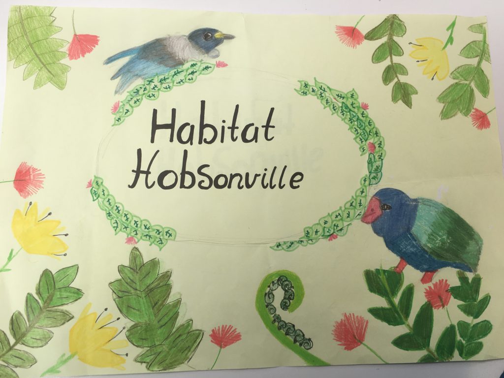
2. Isobel Baxter – I wanted to focus on the community and the bringing back of birdsong. I put the two different birds, a tui and a fantail, to represent the diversity of New Zealand culture and connecting different kinds of people together. The birds are singing because the goal of Habitat Hobsonville is to bring back birdsong and restore their natural habitat. The branch represents the branching out to family, friends and community.
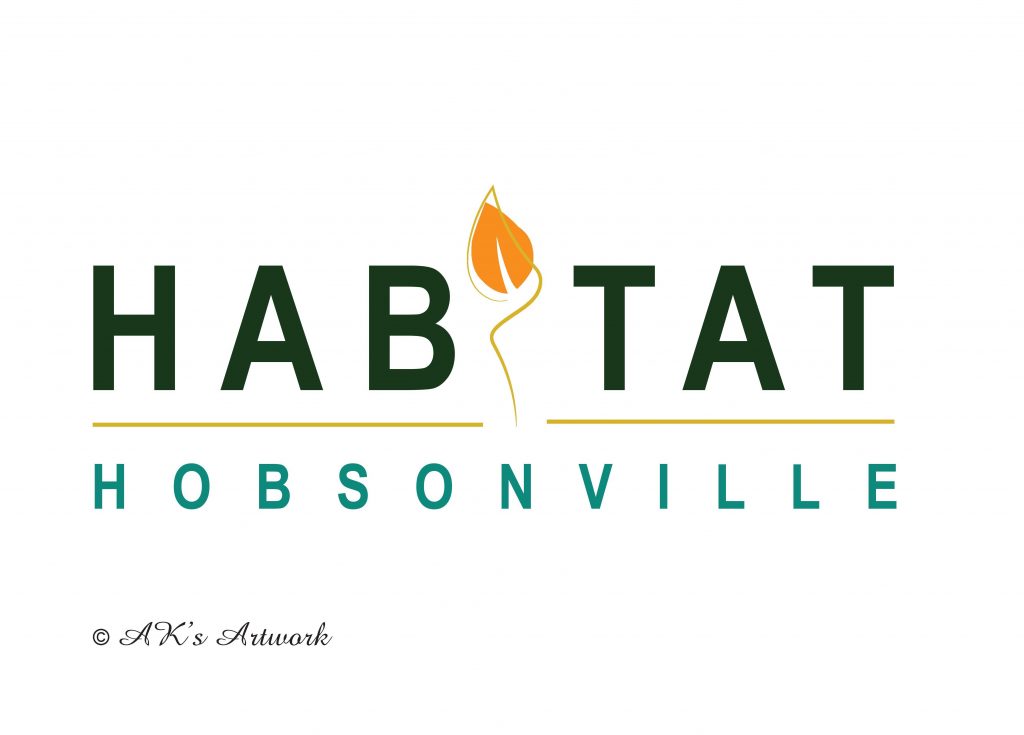
3. Amna Tariq – The logo is very simple and bold. The petal symbol reflects the natural environment and the orange color shows the welcoming attributes of Hobsonville being an inclusive community. Blue and greens are showing sky/coastal life and the greenery we have around us respectively.
4. Anna & Starr Harrison – I tried for simple log and related to the byline ‘bringing back the birdsong’. Colours could be easily changed. This was my idea but my 10 year old son put it together for me.
5. Nabira Faisal Saeed – My logo is showing a native bird 🐦 silver ferns and pinwheel to represent Hobsonville.
6. Esme Harrison – This design represents a house – everything fits together to make a house – the bottom is earth, the middle is water and the roof is sky.
![]()
Please note you can vote by emailing your favourite vote to [email protected] from April 1 – midnight April 9.
GOOD LUCK!
[/fusion_builder_column][/fusion_builder_row][/fusion_builder_container]